Brand & press kit
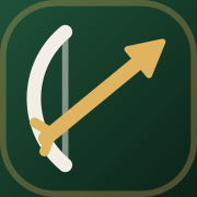
The bow is drawn; the arrow is the position. Loxpad takes its name from Robin of Loxley and its craft from the fletcher, who made the arrows. The mark is a longbow loosing a brass arrow up and to the right: a coin with a position behind it. Use these assets as they are.
loxpad
Usage
- Wordmark is always lowercase: loxpad.
- Keep clear space of one mark-height around the lockup.
- On light grounds, keep the Lincoln tile — never recolour the arrow.
- Don't stretch, outline, rotate or add effects to the mark.
- Don't imply affiliation with Robinhood Markets, pons or Lighter.
Colour
Deep slate, glass cards, white ink. Colour only when it means something.
Slate
#10171B
Page ground
Glass
White 6%
Cards, with a 12% white hairline
Control
#2A3137
Pills, avatars, value chips
White
#FFFFFF
Ink and the primary button
Muted
#B2BEC5
Secondary text and labels
Up
#5AC774
Gains, long, live
Down
#FE3E40
Losses, short, sell
Live price
#3093EA
The backing market's mark
Lincoln green
#1F5139
Brand and logo only
Typography
One family. Geist for everything, Geist Mono for addresses. Both open-source.
Interface · Geist
Fletch a coin
- Display
- 44–88px bold
- Page titles
- 24–40px bold
- Section titles
- 20–24px bold
- Figures
- 18–22px medium, tabular
- Body
- 14px regular
Addresses · Geist Mono
0x815c…9dE7
Contract addresses, hashes and transaction ids only. Prices, tickers and every other number use Geist with tabular figures.